
Scott Ritchings
Graphic Designer + Illustrator
Portfolio of a graphic designer + illustrator
Tim Hortons Community Cruiser
Partial Vehicle Wrap

Tim Hortons Community Cruiser
Tim Hortons was looking to refresh their much loved Community Cruisers that bring coffee and baked goods to community events and youth sporting events.
Using a general concept and provided photos and logos, a basic concept was developed and refined to create a friendly wrap that was adaptable enough to look good on multiple vehicle colours.
The design was developed into a kit that distributed to regional areas throughout western Canada (Manitoba to British Columbia) and wrapped locally onto company vehicles.
- Client: Tim Hortons(through SuperGraphics)
- Role: Art Direction, Graphic Design, Prepress
- Year: 2010
Rainmaker Entertainment
Matte Painting
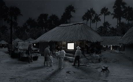
Matte Painting
I had the opportunity to create a matte painting for an animated film. Semi realism was important and the image started as a composite of dozens of separate photos. Texture samples from some photos were used to create brushes to 'paint' with. After a general layout was approved, the collage was then heavily painted over to build a cohesive image used in the final shot. The people in the image were eventually replaced with CG models in the style of the film.
- Client: Rainmaker Entertainment
- Role: Matte Painter
- Year: 2011
Cassandra Simonds
Identity + Business Card
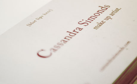
Cassandra Simonds – Identity + Business Card
I was approached with a request for building an identity and business card for a make up artist who focused on bridal party make up after an unsatisfying experience with another designer. She was concerned that while this designer had presented 'nice' designs, none of them fit into the image she was looking for.
After a conversation and survey of her business, clientele and the message she wanted to convey, I was able to narrow down the direction to go in. The final design is elegant and soft with just the right amount of playfulness.
The card itself serves triple duty. First as a business card, but a little message of '{blot lips here}' across the top gives it a second function. Cassandra also wanted to remind her clients of their beauty and I conceived a message of 'You are beautiful.' across the back of the card that can be propped in a mirror as an affirmative message.
- Client: Cassandra Simonds – Make Up Artist
- Role: Graphic Designer
- Year: 2011
Buttons
Small and fun fashion accessories
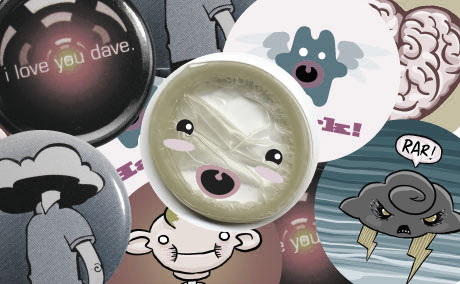
Buttons
I've created wearable merchandise to sell alongside comic books at various conventions I've attended along the west coast. Often times they spring from little doodles in my sketchbook or are inspired by bits geekdom. Some were sold as is, while others had little micro comics that served as packaging. Bruce the Condom came with a comic promoting safe sex and had a condom tucked inside as well! (The button's pinback was not used to fasten the condom to the comic.)
- Client: Personal
- Role: Art Direction, Graphic Design, Prepress, Production
- Year: 2009-2012
Bentall Centre Athletic Club
Wall Graphics

Bentall Centre Athletic Club
The Bentall Centre Athletic Club was looking to liven up their fitness facilities with some super sized graphics for their walls. They wanted full wall graphics that would appeal to their upscale Vancouver clientele. Graphics were to cover the entrance stairs, yoga room wall, locker wall and a long hallway wall opposite the squash courts.
Sourced photos were modified to make for more dynamic images. Colour changes were completed to tie the photos together. The focus on the background models was softened to bring the attention to the foreground model The cycling image was created using two highly modified photos.
- Client: Ivanhoé Cambridge (through Ampco Grafix)
- Role: Graphic Designer
- Year: 2013
S+N
Wedding Invitation

Wedding Invitation
I recently married a lovely woman and we decided to create the invitations ourselves. A traditionally styled invitation wasn't something we wanted. We're a fun and slightly odd couple and we wanted an invitation to reflect that while still remaining an easily identifiable invitation.
Complimentary fonts reflecting our personalities play off each other while a simplified colour palette keeps it all tied together. We used a travel theme and our RSVP was a postcard that came pre stamped to make it a easier to get replies back to us. As a thank you we even included the recipe for the signature drink that was far too much of a hit for a few guests at our reception.
- Client:My Wife and I
- Role: Art Direction, Graphic Design, Prepress
- Year: 2013
Leavitt
Fleet Graphics
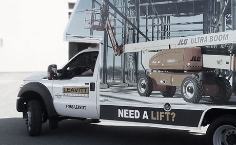
Leavitt Fleet Graphics
Leavitt, a forklift and material handling equipment dealer, was looking to refresh their service vehicle fleet. They wanted to showcase the many equipment vendors they offered on a fleet of vehicles located throughout Western Canada and the Northwest US.
Using images provided by the various vendors, a template was developed for truck canopies to conserve printed material and to ship install ready decals that required no trimming during installation. A kit could be printed using a combination of 16 vendors, each with vendor specific driver and passenger side decals, and a base kit common to the entire fleet. This created a fleet of vehicles tied together with a common theme but with 256 potential unique combinations.
Once the initial truck canopy concept was finalized, the concept and design was adapted onto other vehicle styles. The graphics now wrap a diverse set of working vehicles including service bodies, cube vans and utility trailers.
- Client: Leavitt(through SuperGraphics
- Role: Graphic Design, Prepress
- Year: 2012 - 2013
Exploded View
Book Design + Supplementals
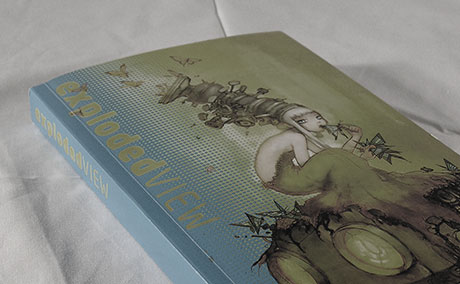
Exploded View
A science fiction themed comic art anthology. A cover illustration was commissioned, line art by
Beyond the book design, I developed supplemental materials to support and market the book. A guerilla marketing campaign was developed which featured posters using colour modified single pages of art from the anthology behind a modified logo with launch party information. I also created bookmarks using the cover art as book store swag.
- Client:
Cloudscape Comics - Role: Art Direction, Graphic Design, Prepress, Story Editing
- Year: 2010
21 Journeys
Comic Book Anthology Design
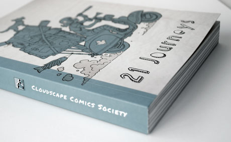
21 Journeys - Comic Book Anthology Design
I was involved with a group of independent comic artists who once a year put together a themed anthology of stories from artists from the Vancouver area. The fifth book was given a travel theme and while previous books were designed collaboratively, I was the sole designer for 21 Journeys.
Given the travel theme, I went with a travel journal aesthetic for the book. Distressed textures, scanned bits of cello tape and drink rings all mark the pages between stories. While the cover and title pages feature handwritten styled fonts to give a feeling of idle doodles while traveling from destination to destination.
The table of contents is comprised of stamps created from images from each story and the title and page numbers have been made to look like their postmarks. Each title page is relevant to the individual story through a custom map overlayed with objects from the comic. I also created a custom transit map based on the iconic London Underground map, turning each artist into a station on the biography page using the same style and font of the original.
- Client:
Cloudscape Comics - Role: Graphic Design, Prepress, Story Editing
- Year: 2011
Cloudscape Comics
Logo

Cloudscape Comics Logo
I co-founded an independent Vancouver-centric comics collective to help artists bring their stories to print. Once the name Cloudscape was settled on, I developed the logo to brand everything with. I wanted to avoid the cliched speach bubble motif and develop something more unviversal and appealing to an audience both within and outside the comic industry. Many people thought the idea of a publishing collective was a bit of a dream and we had our head in the clouds. After many initial concepts, I illustrated the head in the clouds concept literally to become the Cloudscape Comics logo. I was involved as an designer, editor and contributing artist for the first five books and the call just went out for their eighth anthology.
- Client:
Cloudscape Comics - Role: Graphic Design
- Year: 2008
A brief biography of sorts
A creative person by nature and by trade, Scott has been a graphic designer + illustrator since he could put crayon to paper, and a life has been built around that.
Wide interests
Formally trained as a graphic designer with a minor in illustration, creativity has taken Scott into many different directions. Working primarily as a graphic designer and freelance illustrator, there have been forays into:
- Comic book illustration
- Comic book editing
- Art direction
- Matte painting
- Design consulting
- Mural painter
- Face painting
- and more that have slipped his mind at time of writing
Process is important
Graphic design + illustration isn't just about making a great looking identity, brand, or image. Research, thought and purpose are the foundations of every good design + illustration. Without them, something may be superficially pleasing to the eye, but won't connect with an audience as well a piece with the proper work to back it up.

- Location: New Westminster, British Columbia, Canada
- Email: scott@scottritchings.com
- Résumé: resume.pdf
- LinkedIn: Scott Ritchings
- Twitter: scottritchings
- Tumblr: Scott Ritchings' Sketchblog
- Instagram: The view from my phone.